Helvetica Editorial Cover Field (Style-Only, Image-Conditioned)
Style register: late-1960s Swiss-influenced editorial and corporate-cover grammar, Neue Haas Grotesk visual logic, generous margins, single dominant photographic image cropped tight inside disciplined geometric framing. Visual field only, no readable text.
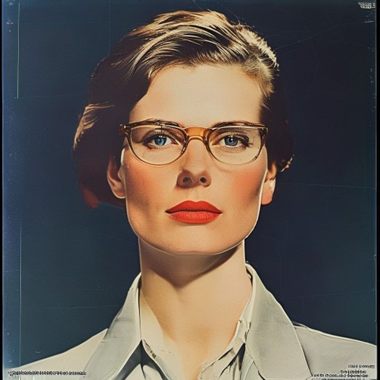
The prompt
Re-render this image in the visual register of a late-1960s Swiss-influenced editorial magazine cover (Du, Werk, Print, Graphis), circa 1965 to 1972. Treat the picture surface as a generous-margin cover composition: the subject occupies a tightly disciplined central or asymmetric crop, framed by a clean uninterrupted color field that takes 25 to 40 percent of the canvas. Color field is one flat unmodulated chromatic plane (Helvetica red, deep cobalt, slate grey, or warm cream) with hairline-thin geometric rule lines suggesting where titling and bylines would sit, but render no legible letterforms, only the structural ghost of where type would have been. Photograph rendered in saturated full-color or high-contrast black and white, treated as a single decisive image, no collage. Edges of the color field are mechanically precise, slight 1mm misregistration halo at one seam to read as offset litho on coated stock. Mood: confident, restrained, the corporate-rational moment when modernism was becoming the official visual language of multinational capital. Strictly no on-canvas text, no legible lettering, no signature, no watermark, no logos. Preserve the subject, pose, and composition of the source image exactly, change only the medium and rendering. Aspect ratio matches source.
What it is doing
Helvetica was sold as the neutral typeface, the one without ideology. By the 1970s it was the visual signature of every multinational corporation, every government bureaucracy, every airport, every tax form. A typeface is never neutral once it is used by everyone in power. The Swiss invented Helvetica intending modesty and discipline. American corporations adopted it to look modest and disciplined while consolidating power. The cover format inherits that ambiguity: it looks restrained and serious because restraint and seriousness were branded as the visual style of credibility. Looking like authority and being authority are not the same thing, and Helvetica blurred that line on purpose.
Tuning knobs
- Color field tone: `Helvetica red` (signature) vs `cobalt blue` vs `slate grey` vs `warm cream`
- Field ratio: `25 to 40 percent of canvas` (signature) vs `dominant 60 percent (banner-heavy)` vs `minimal 10 percent border`
- Crop tightness: `single decisive image tight crop` (signature) vs `medium contextual crop` vs `full-bleed no margin`
- Photo treatment: `saturated color` vs `high-contrast B&W` vs `desaturated muted tritone`
- Rule lines: `hairline ghost baselines` (signature) vs `no rules at all` vs `heavy structural bars`
Style lineage
Learn the visual culture this draws from: Monotype.
Related prompts
See all 8 prompts in the Bauhaus grammar · Open in the gallery