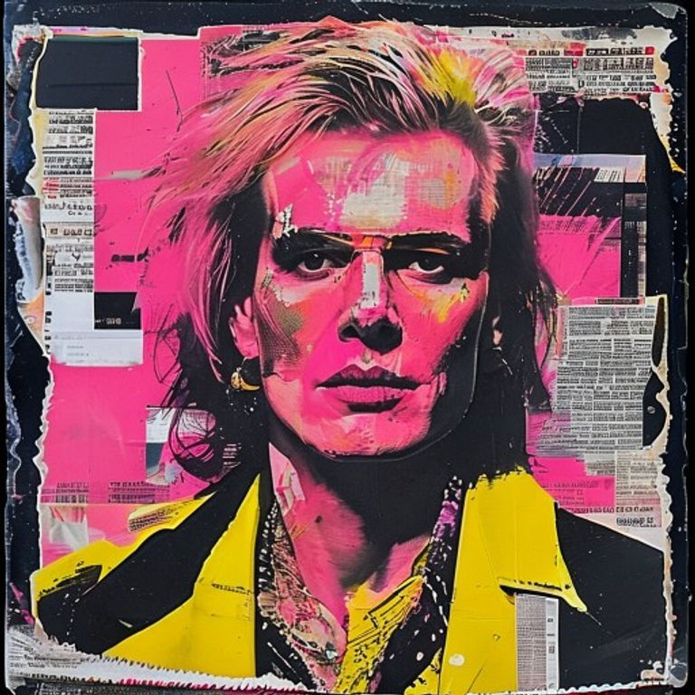
Jamie Reid Ransom-Note Sleeve (Sex Pistols 1977 Register)
Source-image rendered as a 1977 Jamie Reid punk sleeve: cut-out newsprint, xerox degradation, hot pink and yellow shock, Situationist detournement made graphic.
The prompt
Render the source image in the visual register of a 1977 Jamie Reid punk sleeve for the Sex Pistols. Palette built on shocking hot pink, lurid acid yellow, jet black, and tabloid newsprint cream. Subject treated as if photocopied multiple generations down on a degraded xerox machine, then cut out with scissors and pasted onto a layered ground of torn newsprint, cut-out paper rectangles, and ripped magazine fragments. Edges deliberately rough and slightly off-square. Visible photocopier streaks, toner build-up, and registration drift. Cut-paper shadows where pieces overlap. Background reads as a defaced page rather than a designed composition. Square 12-inch LP-jacket framing where source aspect allows. Mood: aggressive, sneering, deliberately ugly, anti-aesthetic, Situationist, scornful of design itself. No legible text, no band name, no logos, no catalog marks; cut paper fragments may carry abstracted printed-page texture without forming readable words. Preserve the subject, pose, and composition of the source image exactly, change only the medium and rendering.
What it is doing
Jamie Reid trained as a Situationist before he became a sleeve designer, and Sex Pistols covers are Guy Debord with a glue stick. The ransom-note aesthetic is not a style, it is an argument: under spectacular capitalism the only honest graphic act is defacement of the existing image-economy. Anything you compose from scratch will be absorbed; only what you tear and reassemble retains an anti-relationship to the system. Borrowing this register today is borrowing the argument while knowing the argument has been absorbed many times over (every yogurt commercial that uses cut-paper letters owes Reid a royalty).
Tuning knobs
- Xerox degradation: light (first-generation copy) to severe (tenth-generation, near-illegible)
- Color shock: pink+yellow (canonical) or pink+black (God Save canonical)
- Paper-tear violence: clean scissor cuts to ragged hand-tears
- Newsprint density: sparse (one layer) to dense (full collage)
- Composition refusal: centered (controlled chaos) to deliberately off-balance (full anti-design)
Related prompts
See all 28 prompts in the Album-Cover grammar · Open in the gallery