Album-Cover / Style prompt
Motown Soul Portrait (Style-Only, Image-Conditioned)
Style register: Motown Records 1963 through 1972 LP cover grammar, glossy four-color studio portraiture, the artist beautifully lit and impeccably styled, the visual equivalent of the Funk Brothers' production polish.
Customize this prompt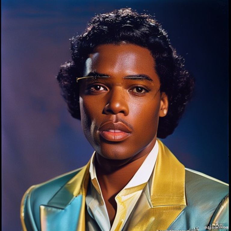
The prompt
Re-render this image as a Motown Records LP cover photograph from the Hitsville USA era, between 1963 and 1972, in the visual register of The Supremes Where Did Our Love Go, Marvin Gaye What's Going On, an early-1970s soul-keyboardist portrait sleeve, The Temptations Cloud Nine, and a late-1960s Miracles sleeve. Shot on medium-format film (Hasselblad 6x6) under controlled studio strobes: a main key light at 45 degrees, a softer fill light reducing shadow density to a 2:1 ratio, a hair-light rim defining the silhouette against the backdrop, the lighting professional and unforgiving and IMPECCABLE. Skin rendered glossy, perfectly retouched, even tone, no shine on the forehead, the dignified glamour of mid-century studio portraiture. Wardrobe and styling assumed elegant: sharp tailoring, satin, sequins, the dignity of the well-dressed Black middle class asserted into the frame on principle. Backdrop options: solid sweep paper in a saturated mid-tone (powder blue, lavender, peach, lemon yellow, dusty rose), OR a soft-focus colored gel wash, OR a hard-edged geometric color-block. Color reproduction: four-color offset lithography on coated stock, slightly oversaturated, slight cyan-magenta dot pattern visible at high magnification, the look of a top-tier 1960s record-jacket print. Composition tight on the head and shoulders, OR group formation in tight wedge or chevron, eyes catching a small white catch-light, smile direct or thoughtful. Typography compositional space: a clean block of swash-italic script or bold geometric sans at the top (do NOT render legible text). Square 12-inch LP-jacket aspect ratio. No legible text, no Motown logo, no studio mark. Preserve the subject, pose, and composition of the source image exactly, change only the medium and rendering.
What it is doing
The soul music record label founder demanded the artist arrive at the studio in a suit. The Motown cover is the political assertion that the Black artist is dignified, glamorous, professionally photographed, and on a major-label sleeve in every American suburban living room. Glamour as uplift, the politics of respectability rendered as Hasselblad and good wardrobe. The register IS the strategy.
Ways to change it
Pick any of these in the gallery and the choice is added to the prompt you copy.
- Backdrop: powder blue sweep paper (signature) vs lavender / peach / lemon vs geometric color-block vs soft-focus gel wash
- Lighting ratio: 2:1 key-to-fill, soft hair rim (signature) vs flatter editorial vs harder dramatic
- Group vs solo: single tight head-and-shoulders vs chevron group formation (signature for Supremes/Temptations register)
- Era: 1963-66 look, matching suits or gowns, pastel sweep, bright posed smiles vs 1968-72 look, natural hair, earth tones, moody gel light, serious gaze
- Color saturation: slightly oversaturated 1960s offset (signature) vs accurate restrained
- Typography style: swash italic script vs bold geometric sans vs psychedelic late-period
Style lineage
Learn the visual culture this draws from: Wikipedia.
Related prompts
See all 28 prompts in the Album-Cover grammar